Flutter state management. Let’s talk about why sometimes you think something is wrong in your state management, But you can’t really tell what it is. Like those times when your state gets complex. And you can’t really find a way to make it more readable. You think to yourself; this code should be more clear. But you can’t really figure out how to make the code more clear in a way that it still makes sense.
State management patterns are the same
When it comes to flutter state management, there are many options out there. Riverpod, Bloc & Mobx are some of the popular ones out there. But we are not going to talk about any of them. Because they are not the problem. Of course, all of them have their pros and cons, But They all get the job done. And the job is to hold your state and notify the listeners whenever you change that state. The problem that we are talking about is the one that almost always exists no matter which Flutter state management library we use.
State Definition is the problem
So what is the problem if flutter state management solutions out there are not the problem? There might be other kinds of problems, But in this post, we are referring to the state definition problem. The way we define our state is the single cause for most of the problems we face in flutter state management. Let’s talk about it in an example.
This is something I have seen in a lot of projects. At first, we define a state management unit like Bloc, Store, or even a ChangeNotifier. It doesn’t matter which one we use because they are not our problem. So we have a small state with a few properties in it. Everything looks good and works fine. Then as we develop our flutter app, we start changing our state, adding more and more properties to it. Making it bigger and bigger. It’s not necessarily bad to have a big state unless it’s confusing and not readable. At this point, maybe it is wise to separate our state management unit into smaller state management units. Everything’s still fine. No problem.
Until it doesn’t make sense
But there are times when things just don’t make sense to you. I’m specifically talking about those times that you are sitting on your chair staring at your screen and thinking to yourself, “How should I change the state definition of my bloc (Store or anything else) so it can reflect the new piece of data I want to show on screen, WHILE the code, is still clean and readable”. I’m not saying that you won’t solve the problem.
In the best-case scenario, you will come up with a way to update the state definition while the code is still readable. In the worst-case scenario, you will update the state you defined, but the code is just bad. Either way, you have put time and energy into something that should not have required that much time and energy. And you’re most likely going to do that again when you’re updating that state definition again. Now that is just time and money wasted.
Now even though I have just started explaining the problem and have not exactly made you feel and realize the problem, you may be asking what exactly is wrong with the way we define our state. That is something I will tell you at the end of this series of posts. Right after, I have shown you many of the different problems caused by bad state definitions.
Let’s see the problem in code
We are going to see step by step what these problems are. And then, we are going to see how solutions that are usually used to solve these problems will introduce new problems. At the end, we are going to talk about the real reason why none of these solutions work.

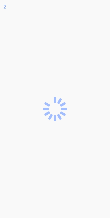
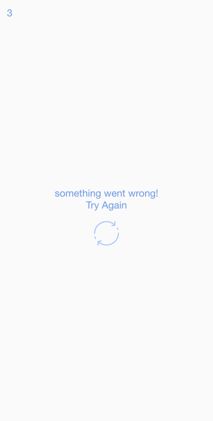
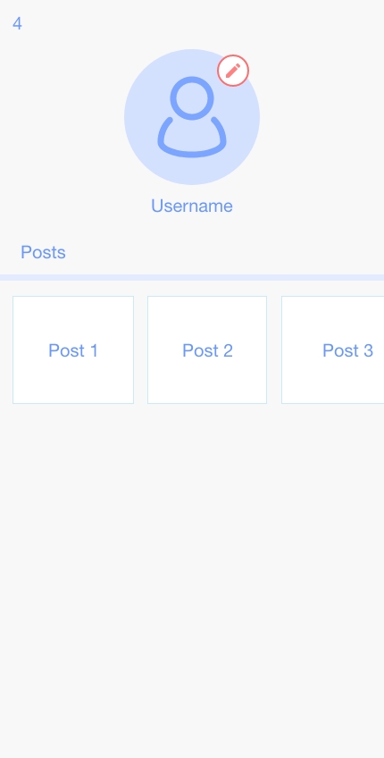
Take a look at the images above. You can see 3 different states of a single screen. We have a user profile screen that shows the user’s avatar at the top and his/her posts below. image 2 shows how our screen looks when the app is getting data from the server. in image 3. We want to define a state management unit that populates data on this screen. Here is what the defined state for that state management unit would look like.
For the sake of not making this article long, we are keeping scenarios and code simple. We’re just gonna see the complexity of the defined state over iterations of change.
class UserState {
  final UserProfile profile;
  final List<Post> posts;
  final bool isLoading;
  final Error error;

  UserState(...);
}
We use profile and posts properties to show the data on the user profile screen. We use isLoading flag to determine if the screen is loading and if there was an error. This defined state will cover all our needs in the above screen for now. So everything is fine for now.
Let’s Add more things to our screen
Ok, we’ve developed and completed our screen and the state management unit used for it. After some time, the design of the user profile screen has been updated. And now, we need to implement the new design.

In image 4, we see that an edit button has been added to our design that allows editing profile images. and in image 5, we see that the user profile screen shows a loader indicator when a new image is being uploaded as the user’s avatar. Now let’s see how our code for our state object will change to implement a new design.
class UserState {
  final UserProfile profile;
  final List<Post> posts;
  final bool isLoading;
  final bool isLoadingAvatar; // new property
  final Error error;

  UserState(...);
}
We just added a new property isAvatarLoading flag, to show the loading on avatar image because we can’t use isLoading flag for that, of course. Everything’s still fine. you might look at the code, and it might annoy you just a tiny bit. But you just leave it at that.
Let’s Change the screen even more
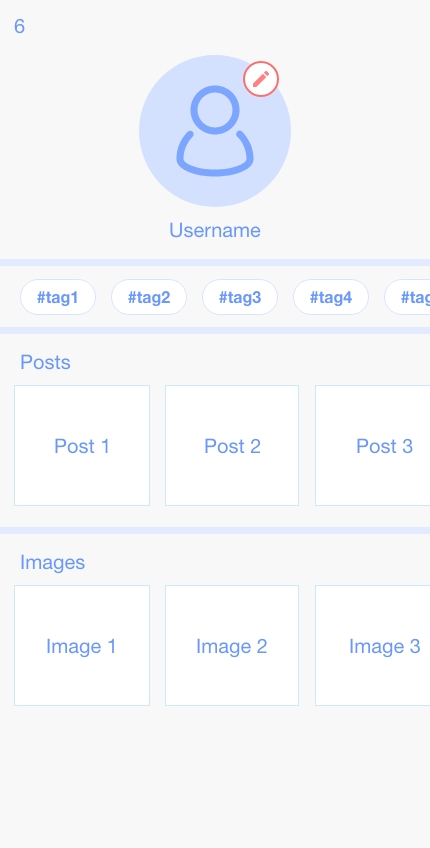
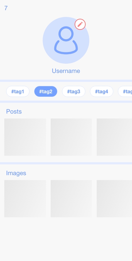
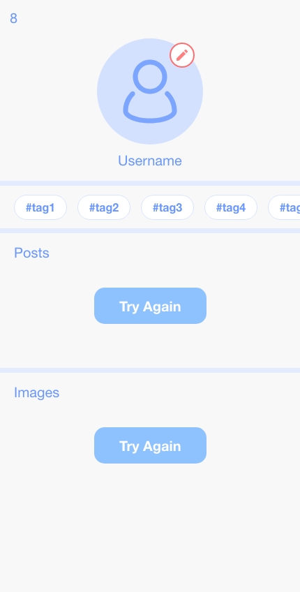
We have a new design for our screen that we need to implement. This is a little bit more complex than the previous design. we load tags from the UserProfile object in our state on screen. Then each time a user selects a tag, the relevant posts and images for tags will be fetched from the server and shown on the screen. In image 7, we see that the shimmer effect is shown when we are fetching relevant posts and images for the selected tag. In image 8, we see that if there was an error during fetching posts and images for the selected tag screen shows a try again button.
Now let’s see how our code for our state object will change to implement the new design
class UserState {
  final UserProfile profile;
  final Tag selectedTag; // new property
  final List<Post> posts;
  final List<String> images; // new property
  final bool isLoading;
  final bool isLoadingAvatar;
  final bool isLoadingPosts; // new property
  final bool isLoadingImages; // new property
  final Error error;
  final Error postsError; // new property
  final Error imagesError; // new property

  UserState(...);
}

// tags shown in screen are read from profile.tags
At this moment, you’re gonna think. Ok, this is getting out of hand. Many of us will see the above code and think this code is really bad. And you come up with solutions like converting the state management unit (Bloc, for example) into multiple ones so you can separate the state and avoid this mess. Or some of us may think, let’s define the state using a Union or Sealed class. It may work in some situations, But they will introduce limitations and problems of their own.
Some of us may say I know how to fix this. But if we are still wasting a lot of time each time we want to change how our states are defined, I say that is not a solution to this problem; that is just a new problem. Creating problems after problems to be solved wastes a lot of time & energy that should have been put elsewhere.
In the next part, we will talk about…
Here we just talked about how states can be big and messy. In the next part, we will talk about how solutions that are used to solve this mess are just new problems.